Solid Tapes
Brand Identity and development of the entire visual concept for SOLID TAPES.
The main inspiration and the starting point for the logo and brand concept was the figure of the tetrahedron, taken from sacred geometry. The visual element is built entirely with various archival images from the tetrahedral kites that Graham Bell made in the early twentieth century.
This is intentionally a self publish project which gives to handcrafted and analogic a new meaning in the digital era that we live in.
Beside the graphic design, I also co-directed the music project with Fabio Vinuesa and Fayna Attasara.
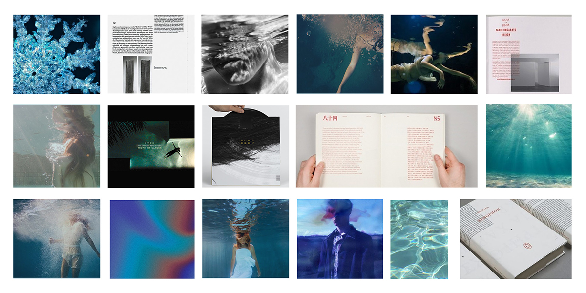
Straight to find find all the references here
Art Direction
Production
Merch
Brand Development
Graphic Design
Corporate Identity
Product Design
Music Poster
Brand Fundamentals
Creative Concept
Creative Naming Development
Packaging
Album Cover Design

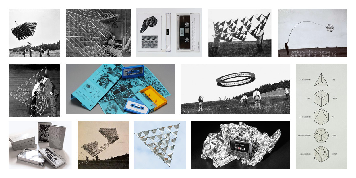
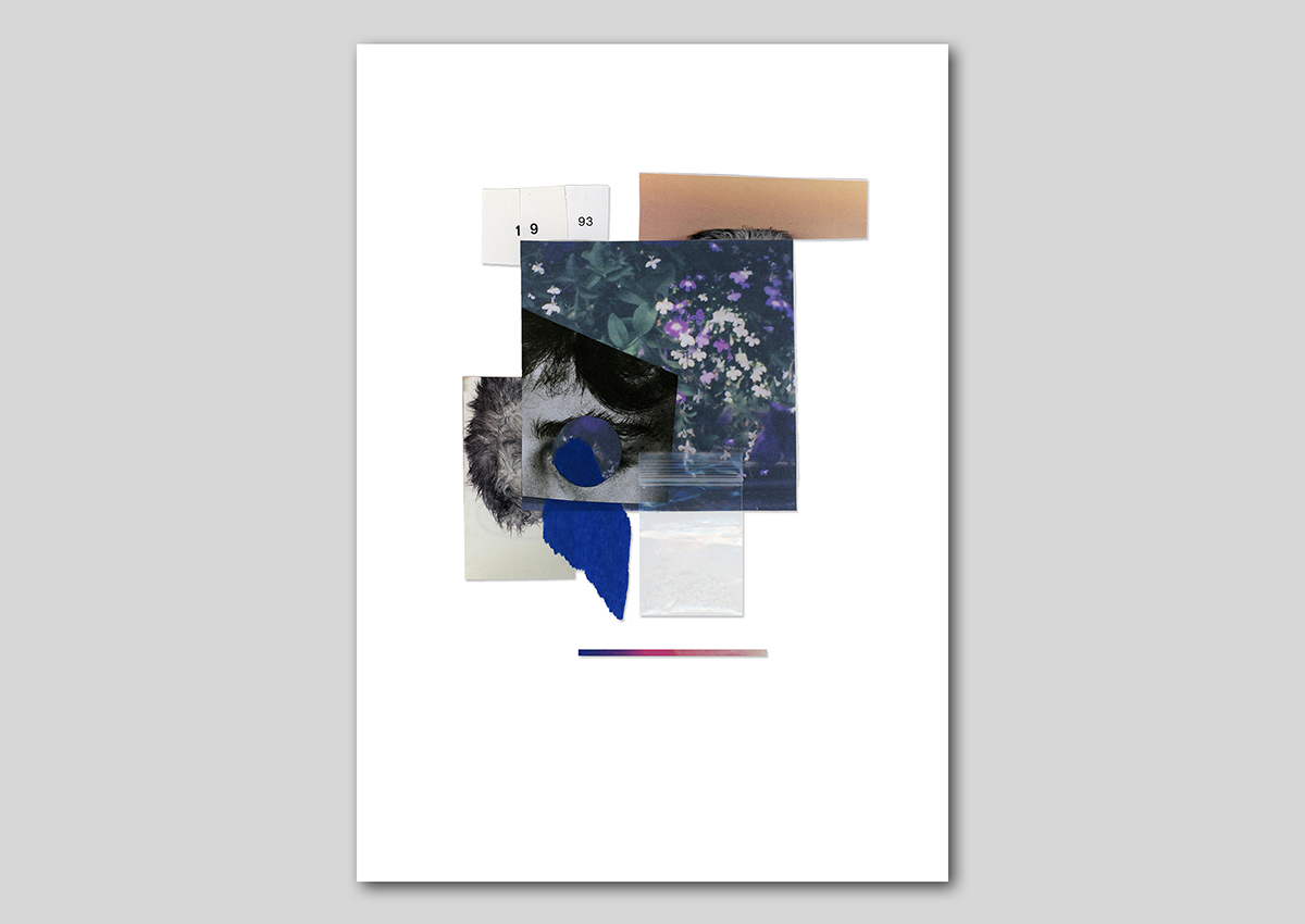
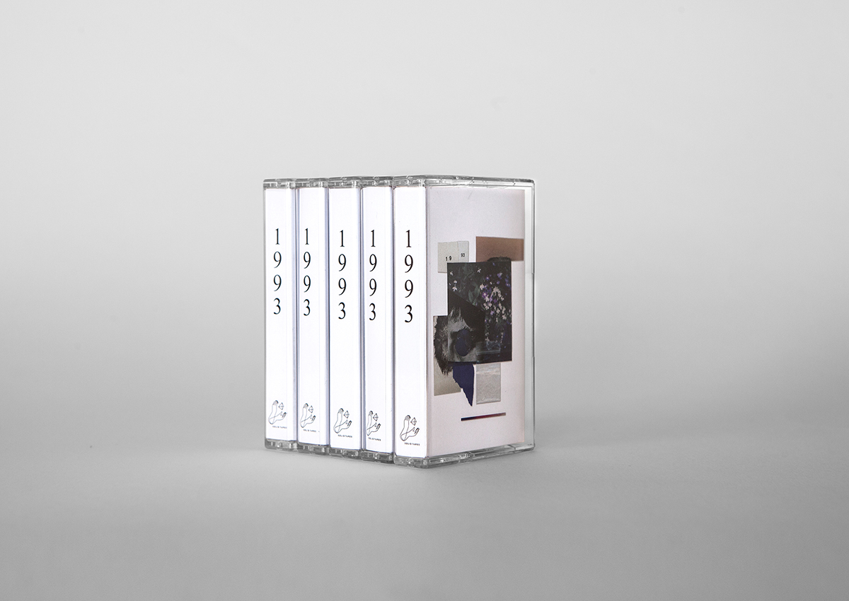
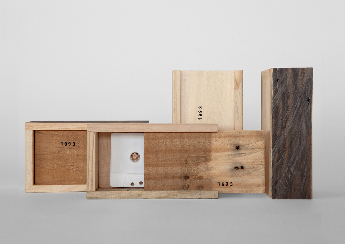
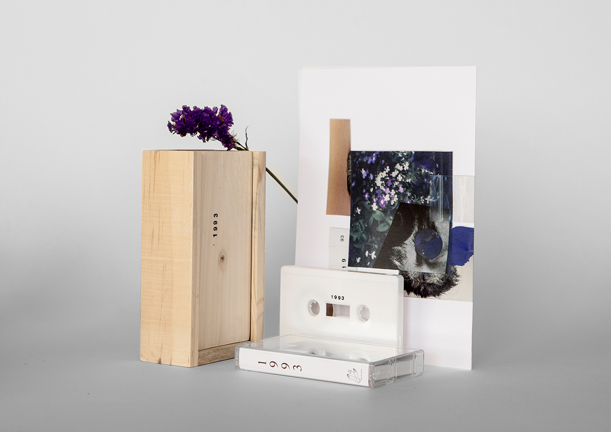
Solid Tapes 1993
Art direction for the cover, all graphic material and packaging for the first release of SOLID TAPES.
This is the first release of SOLID TAPES. Six different artists were invited to create a series of remixes of the song 1993 by artist Abrigo De Pelos. The cover creating in us longing for the years of youth and endless parties.
The packaging is designed in collaboration between the artist and Taller Piccolo.
Straight to find the reference here.
Special thanks to: Davide Fichera (product photography); Taller Piccolo (production); Javier Santos Audera (cinematographer and video direction).
Art Direction
Production
Merch
Graphic Design
Product Design
Music Poster
Creative Concept
Packaging
Album Cover Design
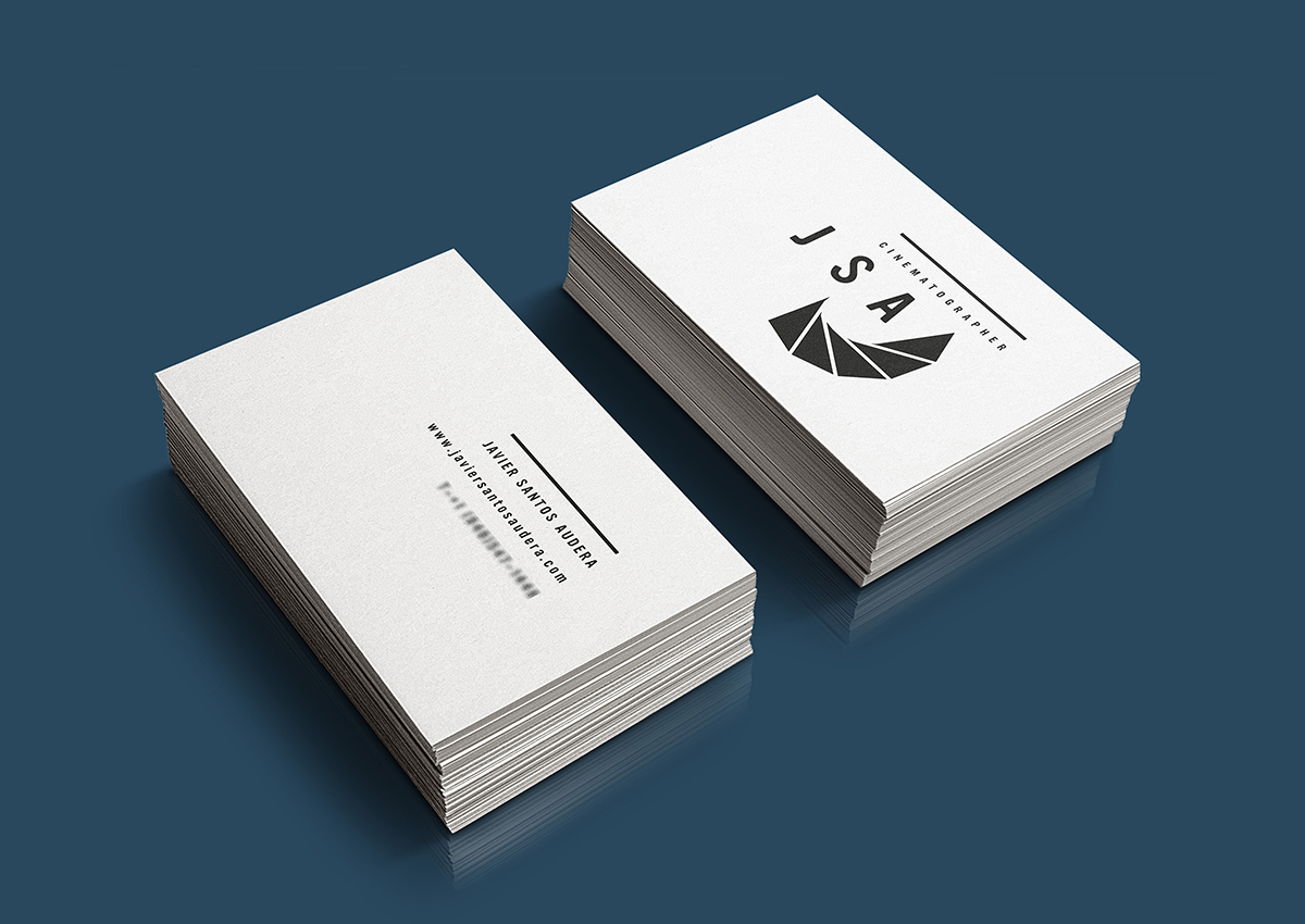
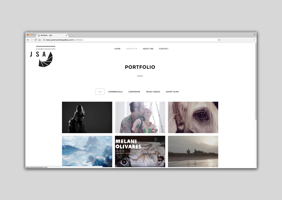
JSA Camera
Corporate identity for the cinematographer Javier Santos Audera.
Javier needed an identity that reveals with just with one glance his professional career and diversity of projects. To achieve this, different parts of a diaphragm are used to create an recognisable symbol.
Art Direction
Graphic Design
Corporate Identity
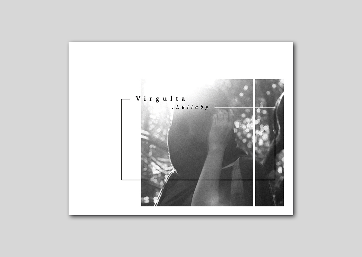
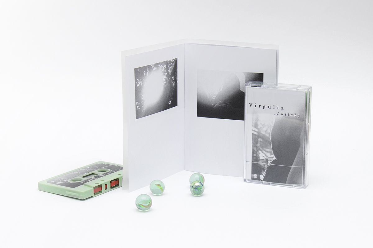
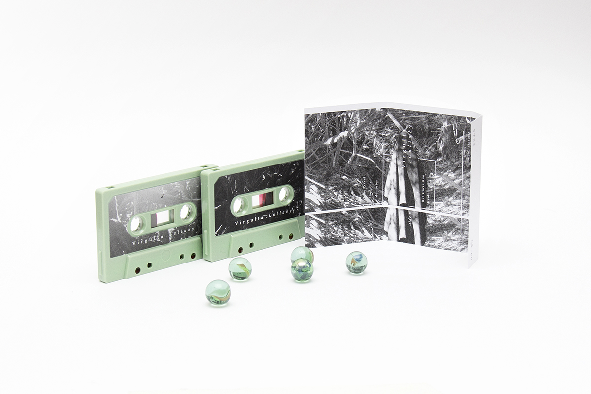
Solid Tapes Virgulta
Art direction for the cover, all graphic material and packaging for the second release of SOLID TAPES.
For the second edition of the music label we applied a series of images to connect three elements: femininity, tenderness and nature.
You can find the release here.
Special thanks to: Fayna Attasara (original photos); Rafa Cobiella (product photography); Javier Santos Audera & Jose L. Gª. Saez (video: script, cinematography and direction).
Art Direction
Production
Merch
Graphic Design
Product Design
Music Poster
Creative Concept
Packaging
Album Cover Design
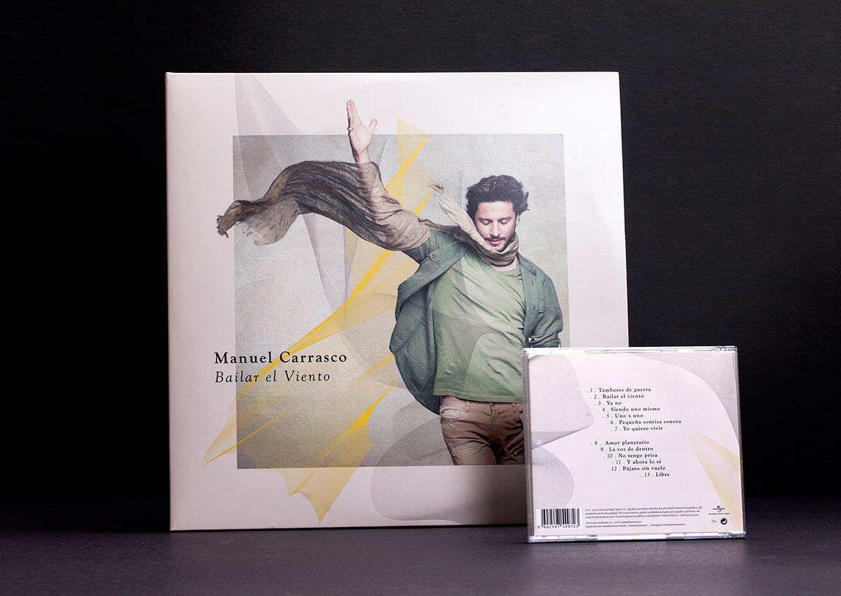
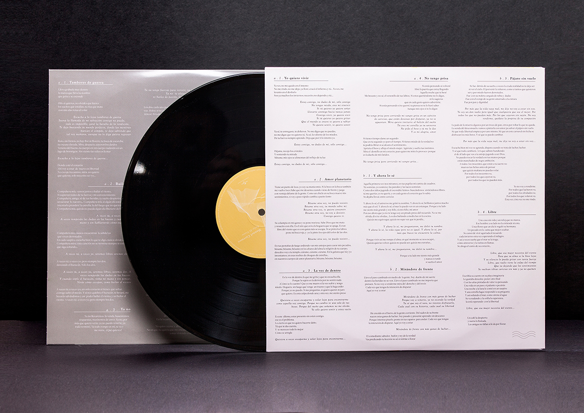
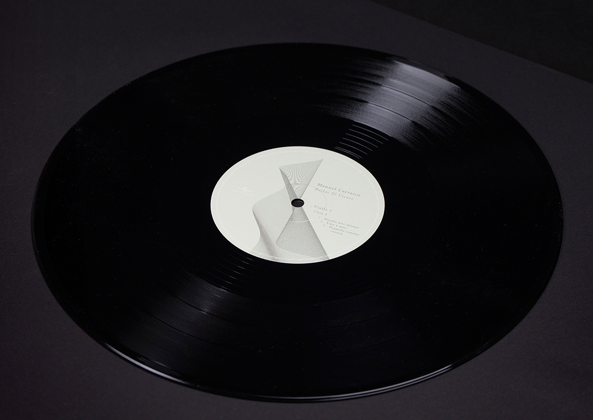
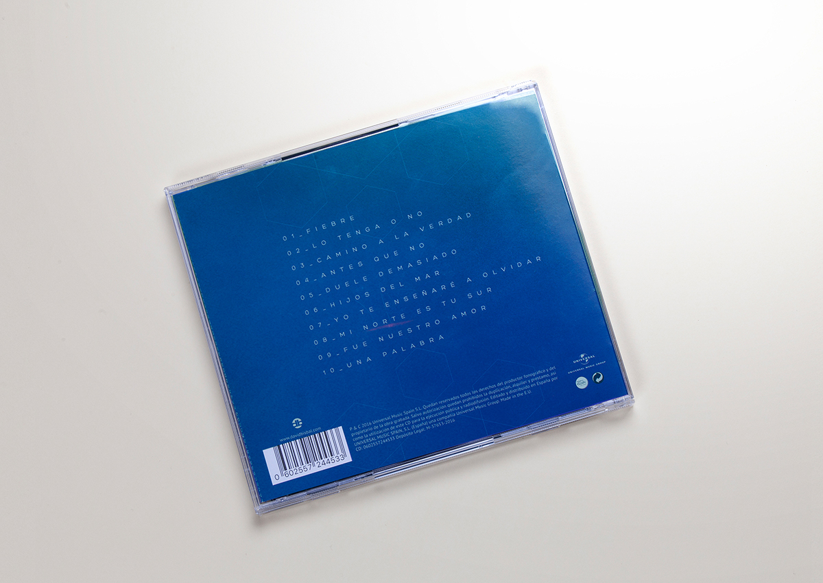
Universal Music Spain MC
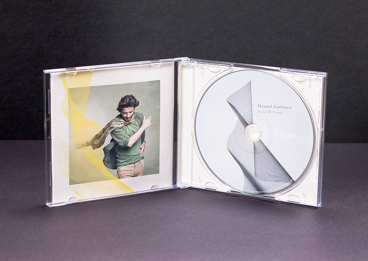
Concept development for the new album of Manuel Carrasco by Universal Music Spain, including art direction for the cover, all graphic material and packaging.
Atmospheric phenomena shape the several discs of this evocative concept: Wind-Art-Movement.
The final design formats include a CD jewel, a CD DigiPack, a deluxe edition box and a vinyl.
Simplicity, elegance and movement form or shape the design principles for this project, making it a very sophisticated edition.
Project done in collaboration with Fikera&Quiche Agency.
Art Direction
Merch
Graphic Design
Product Design
Music Poster
Creative Concept
Packaging
Album Cover Design
Crumb
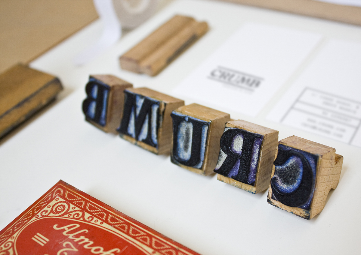
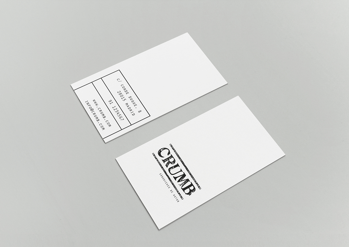
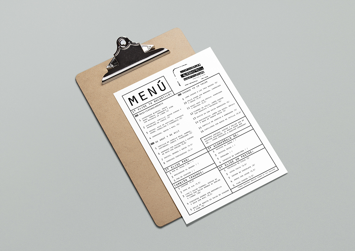
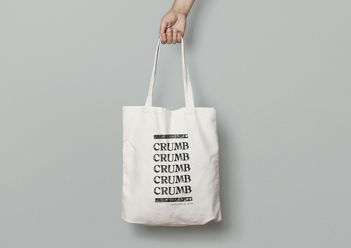
Corporate identity for the bar CRUMB, with focus on reinventing the sandwich concept. Located in the upcoming neighbourhood of Conde Duque in Madrid. ‘Handmade’, love for a good loaf of bread and passion for classic sandwiches were the prompts given to design the logo. We used traditional, wooden stamps that belonged to my dad when he was a kid, and then digitized each letter to convey the values of craftsmanship.
Project done in collaboration with Aida Pozuelo in Swing swing Agency.
Art Direction
Graphic Design
Corporate Identity
Packaging
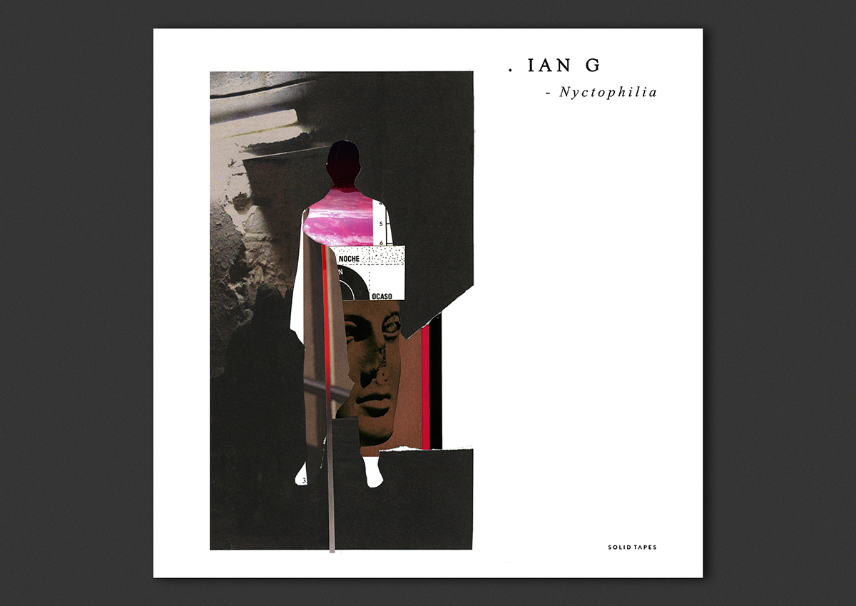
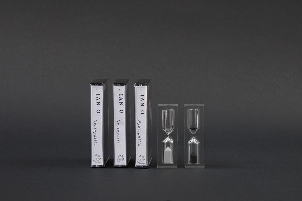
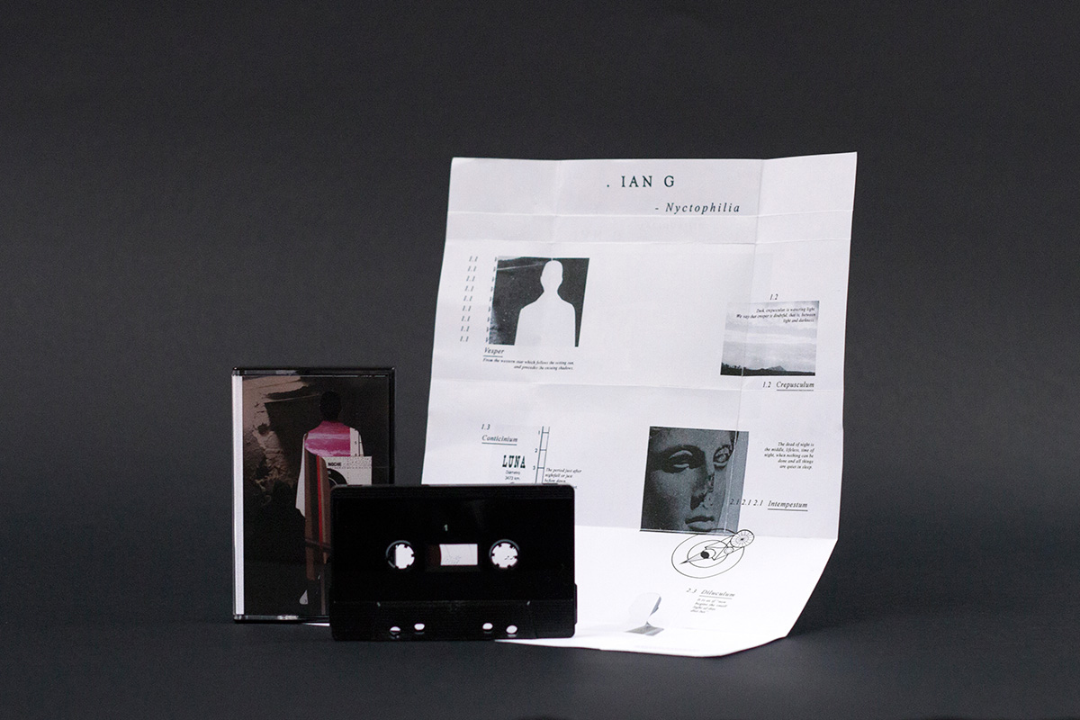
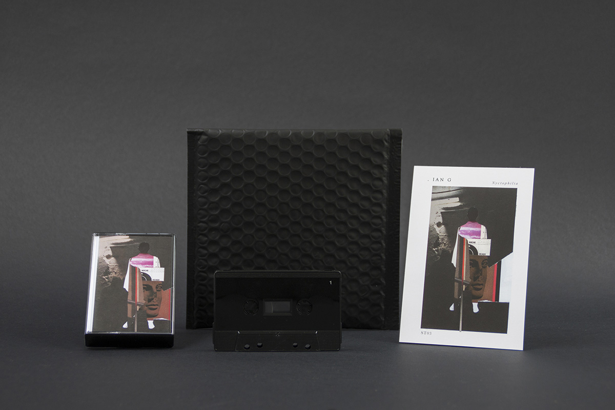
Solid Tapes Ian G.
Art direction for the cover, all graphic material and packaging for the third release of SOLID TAPES.
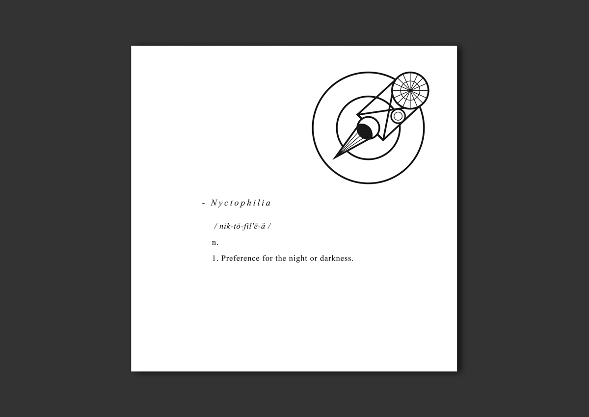
Nyctophilia is love for the night or darkness. The design for this project is born out of this concept. Each song illustrates one of the six parts of which the night is divided, whilst the cover unites the six different elements together.
Straight to find the reference here.
Special thanks to : Ana Huerta (product photography) Adult Video A/V (video).
Art Direction
Production
Merch
Graphic Design
Product Design
Music Poster
Creative Concept
Packaging
Album Cover Design
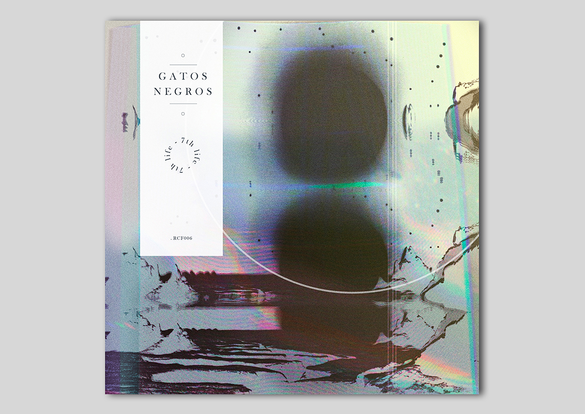
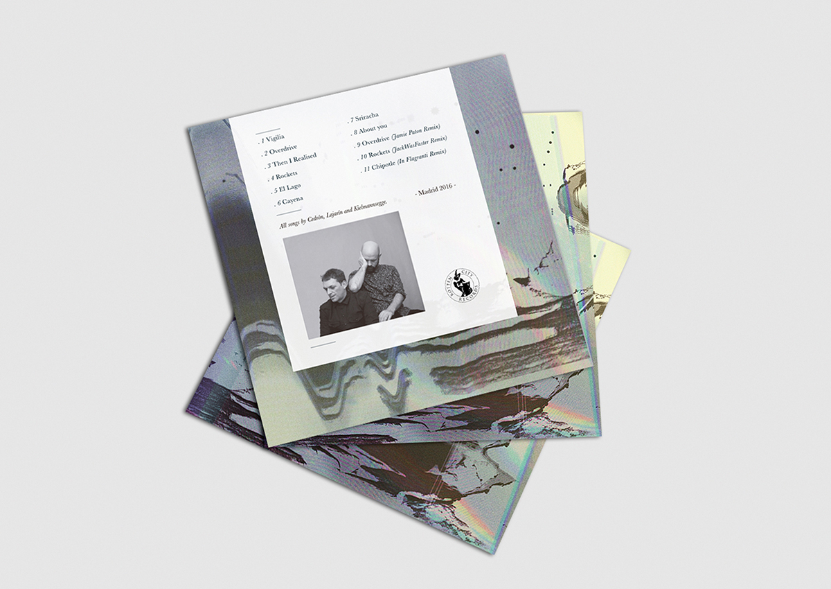
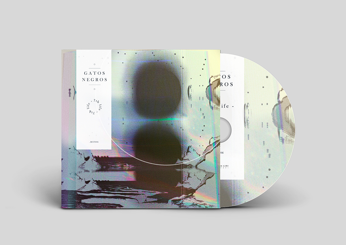
Rotten City Records GN
Art direction for the cover, all graphic material and packaging for the sixth release of Rotten City Records.
Lunar soil, black, lava coloured and circular forms are the elemental cues bringing together the design of posthumous album of Gatos Negros in a CD Digipack format.
Straight to find the reference here.
Art Direction
Graphic Design
Product Design
Creative Concept
Packaging
Album Cover Design
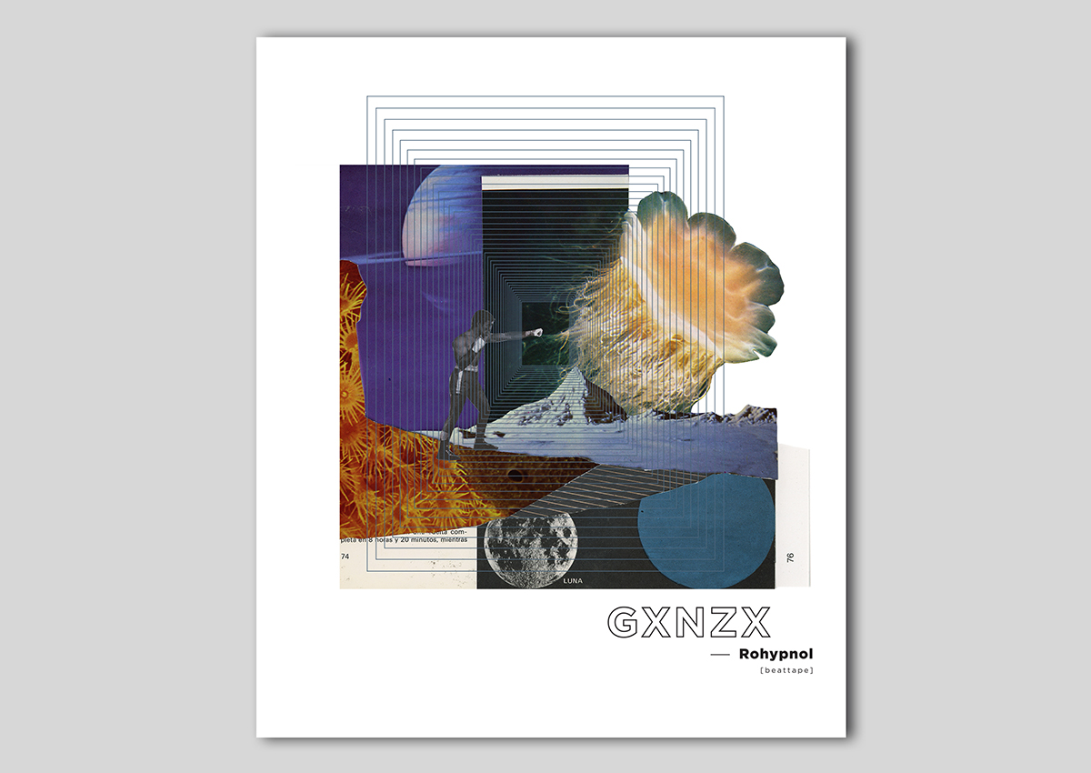
Solid Tapes GXNZX
Art direction for the cover, all graphic material and packaging for the fourth release of SOLID TAPES.
Thinking of the hypnotic sound captured in all the beattape the cover design is based on a repeat pattern that recalls a space mood.
Straight to find the reference here.
Special thanks to: Fayna Attasara (product photography); Moskalus (video).
Art Direction
Production
Merch
Graphic Design
Product Design
Music Poster
Creative Concept
Packaging
Album Cover Design
_IMG_2.jpg)
_IMG_5.jpg)
Lab
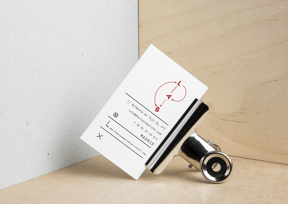
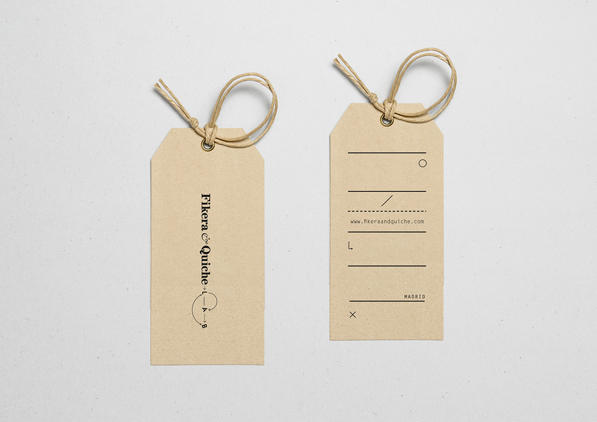
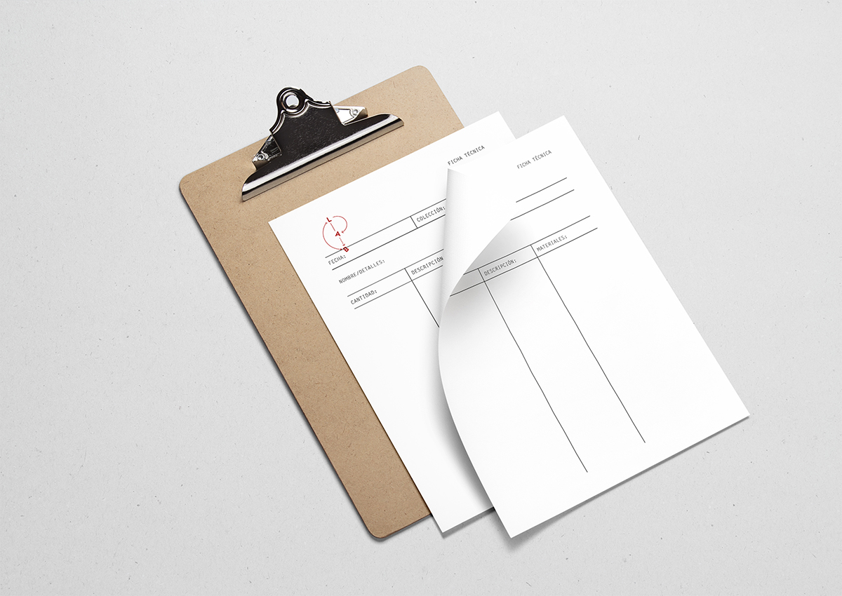
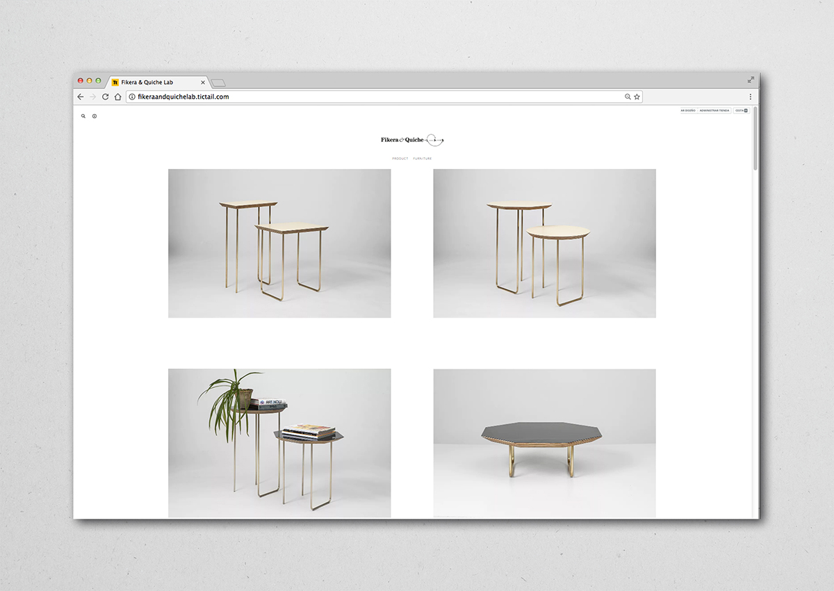
Corporate identity for the product design studio LAB.
The brand LAB - a side project of Fikera & Quiche Agency - is an incubator of ideas and an atelier for different projects in product design, focusing on the integration of tradition, innovation and craftsmanship. Every piece is made in Madrid.
The values of a physical space, La Nave, were our starting inspiration when building the brand identity. We retrieved and applied cartographic symbology from La Nave as the common language used in the space and also in the global identity of the agency. The logo graphically suggests the whole journey of the creation process needed to develop any project at Lab.
Project done in collaboration with Fikera&Quiche Agency.
Art Direction
Graphic Design
Corporate Identity
Brand Fundamentals
Creative Concept
Packaging
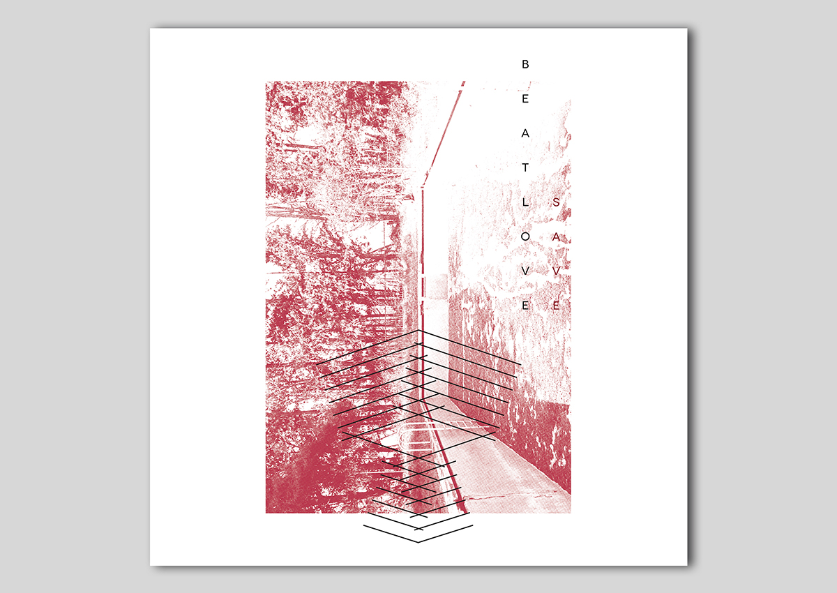
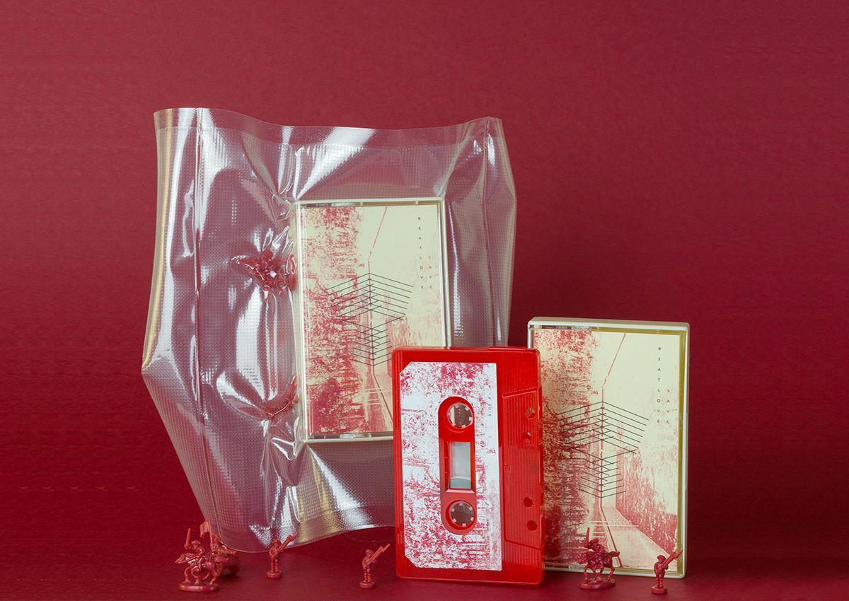
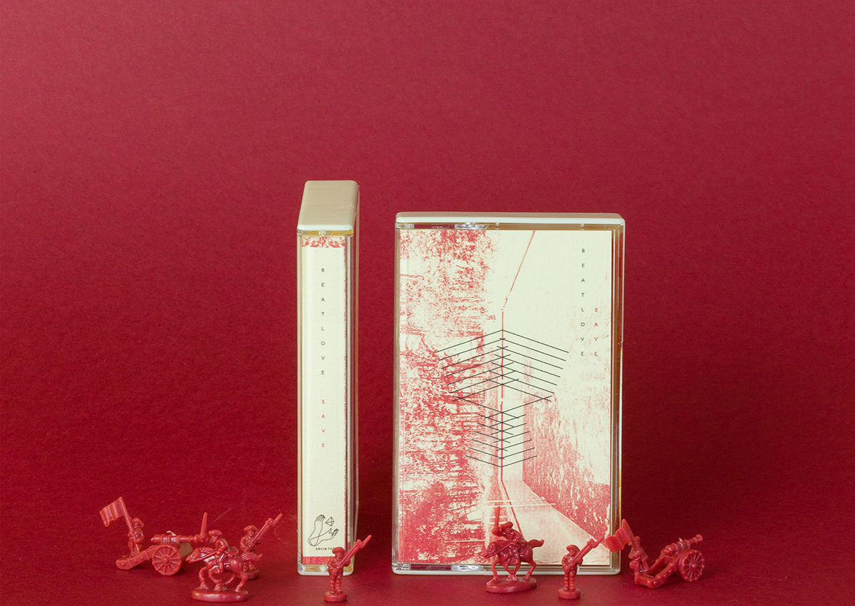
Solid Tapes BeatLove
Art direction for the cover, all graphic material and packaging for the latest release of 2016 for the record label SOLID TAPES.
The fifth release of SOLID TAPES is the latest project by the Sevillian duo BeatLove.
As the cover image portrays, BeatLove requested a connection to the dark and gloomy side of nature. The photo is one I took of an abandoned swimming pool at an old, Spanish villa. Another design fundamental was to include a vector element - one that could also be used individually as a symbol for the release. Vacuum packaging enhances/is a nod towards the title of album.
Straight to find the reference here.
Special thanks to: Miriam Schaefer (product photographer) and Diego López Bueno (video).
Art Direction
Production
Merch
Graphic Design
Product Design
Music Poster
Creative Concept
Packaging
Album Cover Design
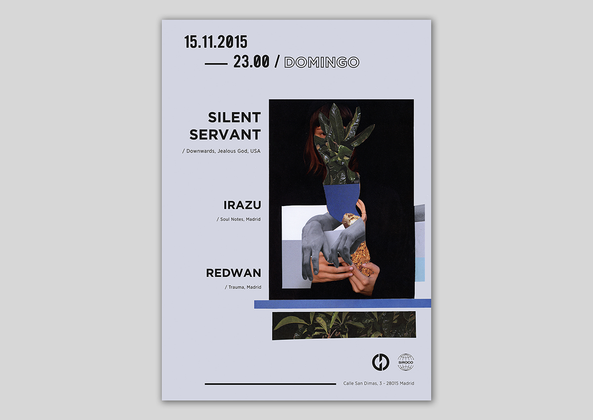
Silent Servant Poster Gig
Art Direction
Graphic Design
Music Poster
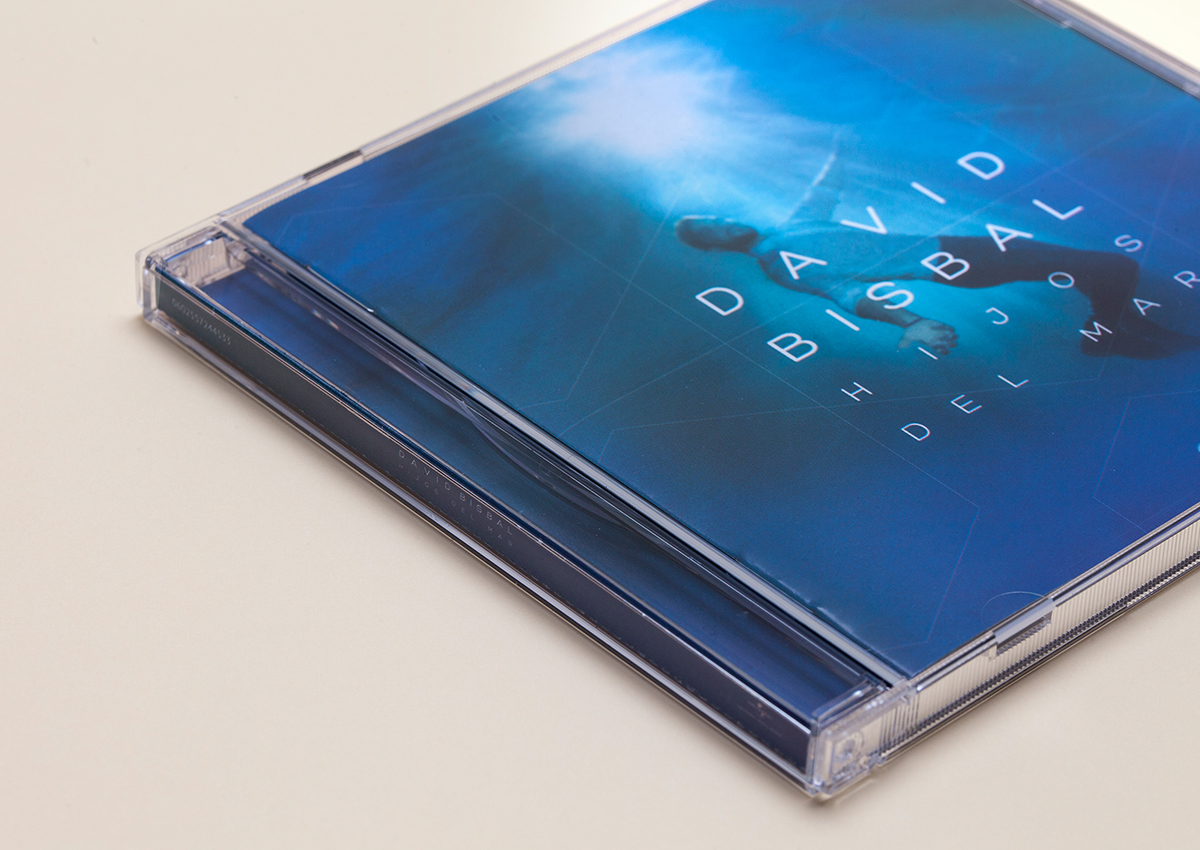
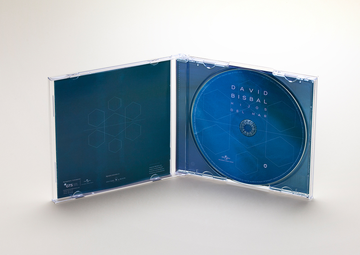
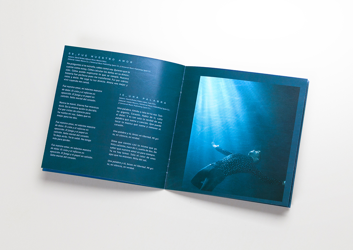
Universal Music Spain DB
Concept development for the new album of David Bisbal by Universal Music Spain, including art direction for the cover, all graphic material and packaging.
Under the broad concept of ‘Ocean Seawater’ we designed a CD jewel format for the album. The visual language and identity are represented through the use of a water molecule: a simplified symbol connecting back to the original concept.
Project done in collaboration with Fikera&Quiche Agency.
Art Direction
Merch
Graphic Design
Product Design
Music Poster
Creative Concept
Packaging
Album Cover Design
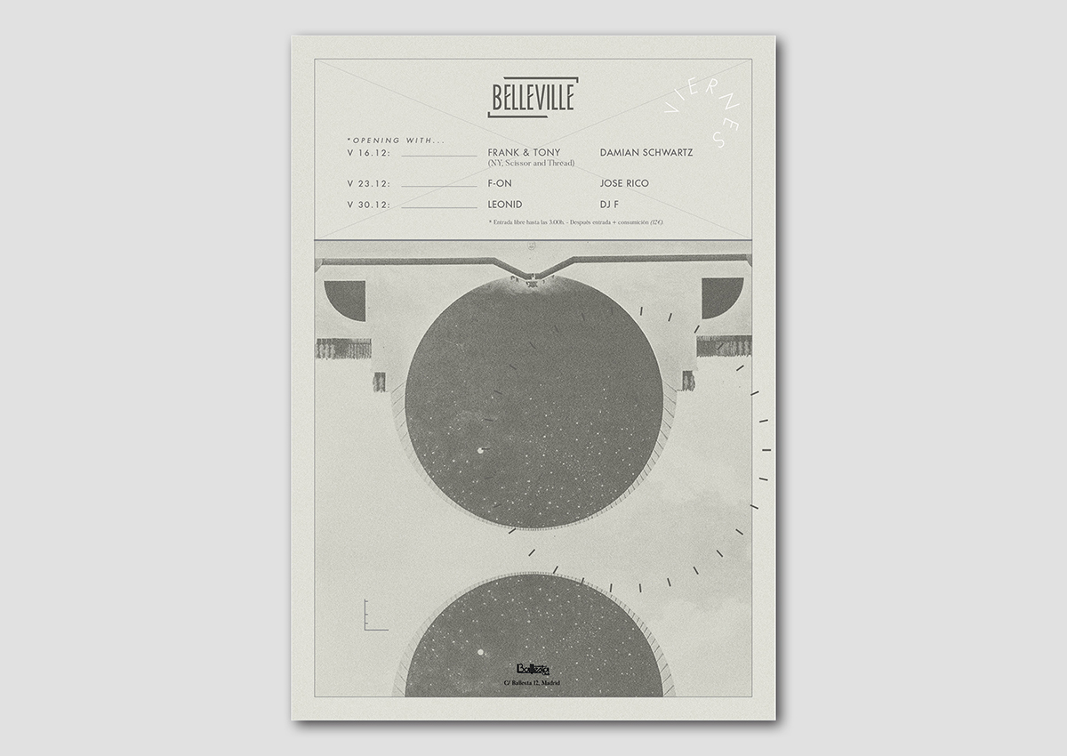
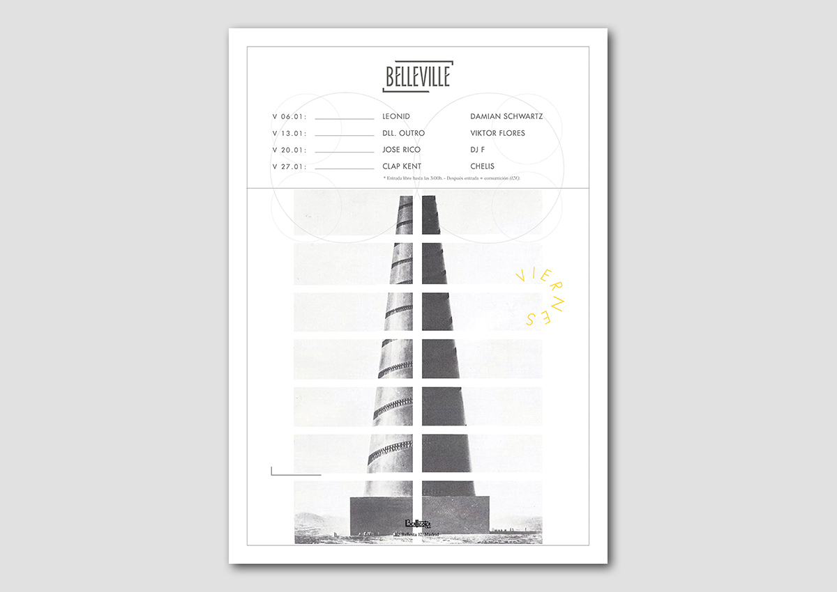
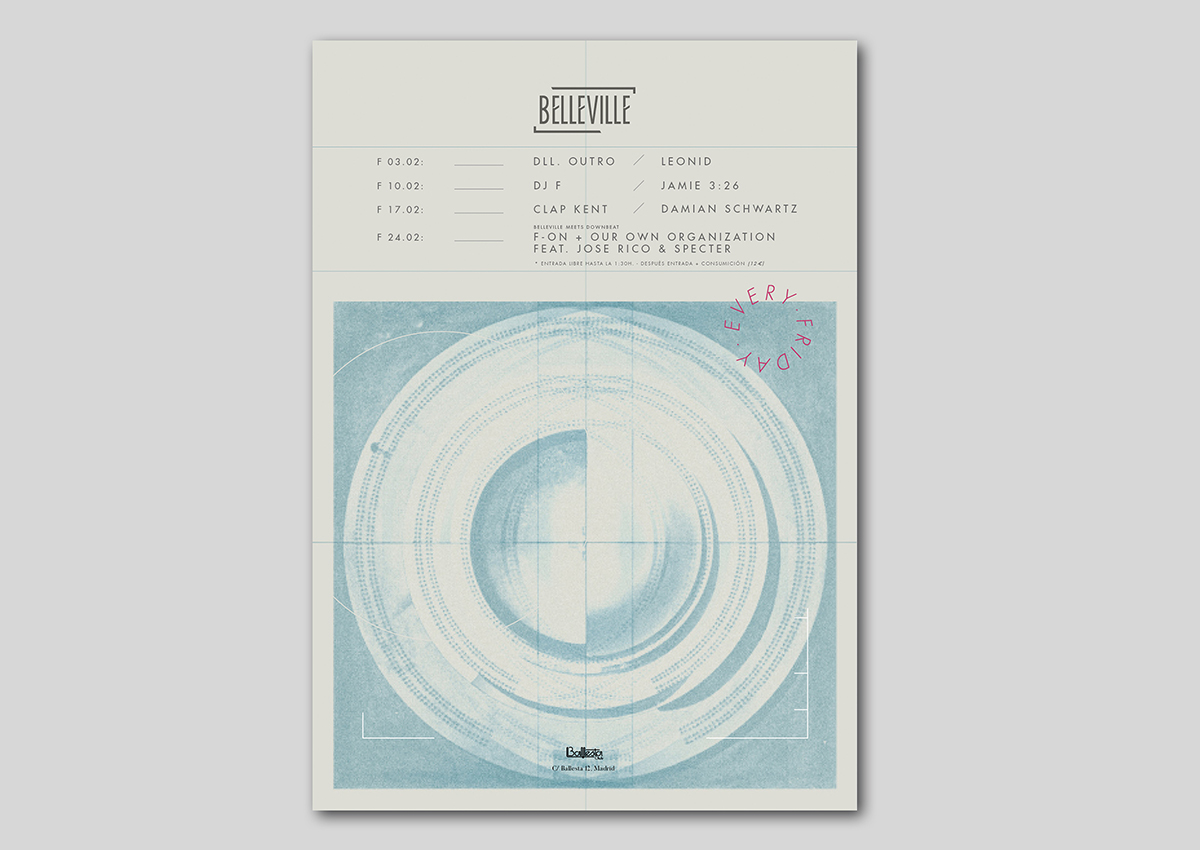
Belleville
Corporate identity and development of all the visual concept for the weekly music night at Ballesta club in Madrid.
Belleville was a middle-class neighbourhood only 50 km away from Detroit where three of the most influential people of Detroit Techno music movement met. As a tribute to this chance coincidence, the small town gives its name to the weekly club night at Ballesta club.
On visualising the name, I worked with the brand manifesto which revolves around three key ideas: a place to disappear from the routines of our daily lives; a time break to re-define the rules of your own self, and the capacity to embrace the magic of the unknown.
All the imagery is developed around the idea of non-real spaces; places of pure fiction or that existed only in paper draft. All the visuals used for monthly posters and digital content is a diverse selection of buildings - projects of visionary architecture from the second half of the eighteenth century.
Art Direction
Brand Development
Graphic Design
Corporate Identity
Product Design
Music Poster
Brand Fundamentals
Creative Concept
Creative Naming Development
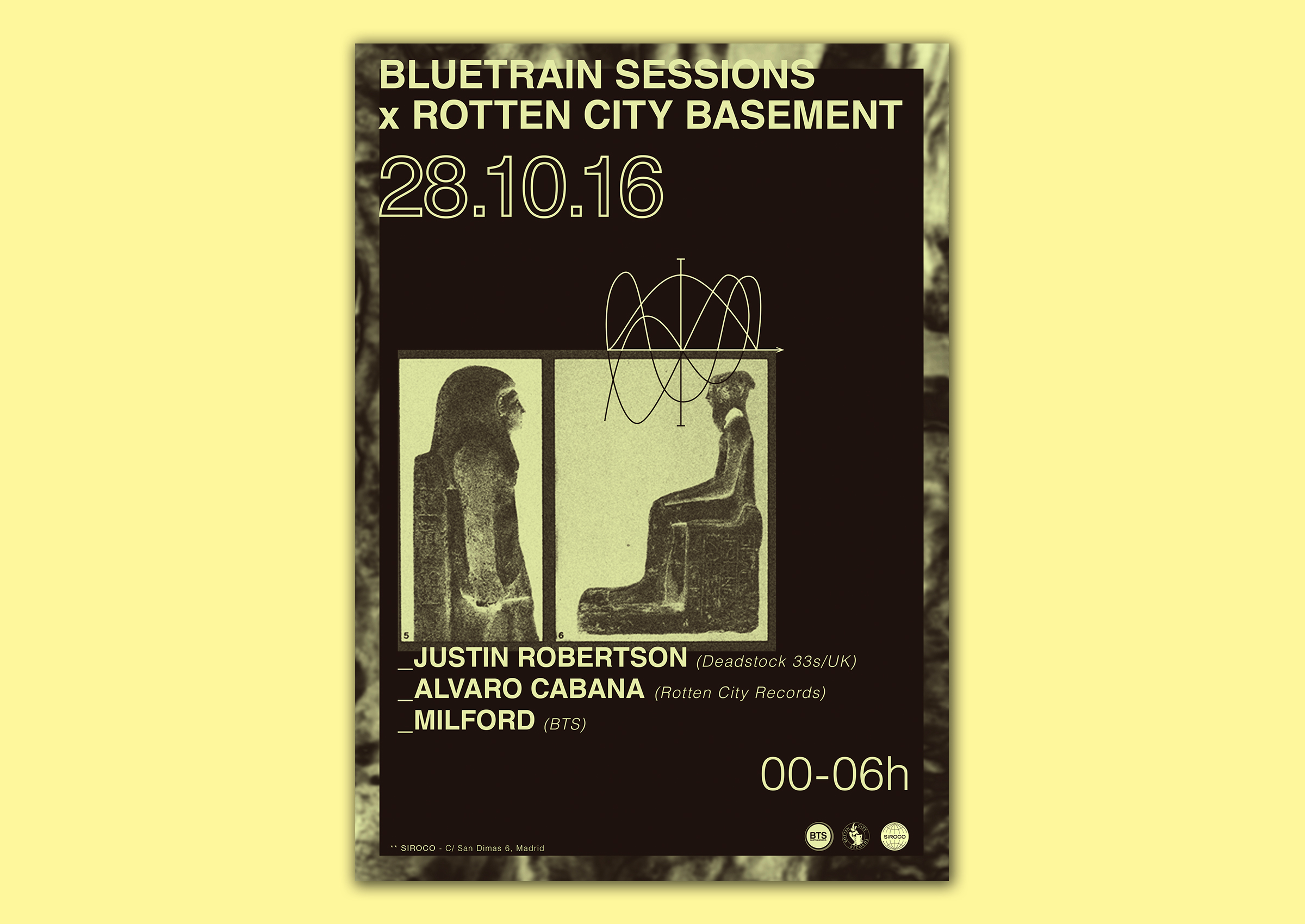
Bluetrain + Rotten City
Art Direction
Graphic Design
Music Poster
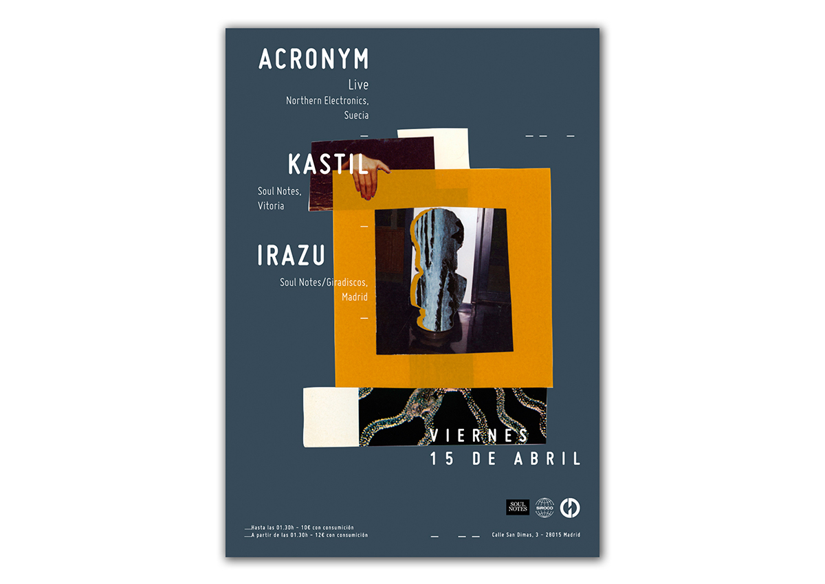
Acronym Poster Gig
Art Direction
Graphic Design
Music Poster
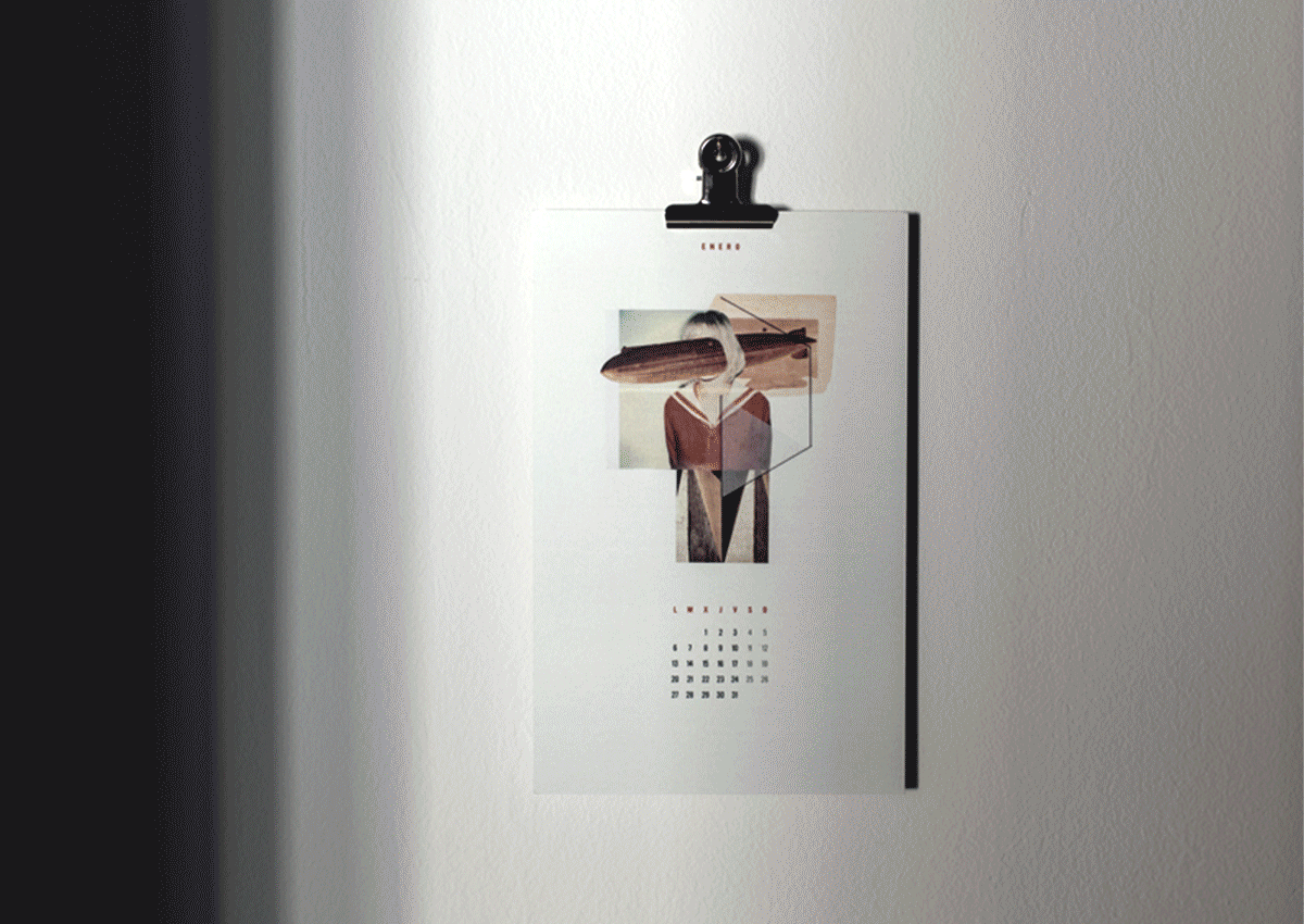
2014Completo
This project is born from two key concepts: firstly, the idea that a year is not over until the last day of the twelfth month has passed, and secondly; an incomplete cube that strings everything together (cube: 12 edges / 12 months). Each month has been composed using twelve of the 60 variations that fragmentary cube can have.
Using the collage as a technique we built unique images for each month of the year. All the graphic material was collected specifically and individually for the project, the result was a limited edition of 80 copies of the 2014 calendar.
Project done in collaboration with Maykel Lima.
Art Direction
Graphic Design
Collage
Creative Concept
Packaging
Production
Tocados Cárnicos
A series of collages on paper designed specifically for the second edition of La Carnicería (“The Butcher”). Thirteen designs where meat is the perfect women’s headdress.
La Carnicería was a project curated by Teresa Jiménez (a.k.a papaissue) and Gema Arias. Under the name “con el arte se vive mejor” (life is better with art) they set up a pop-up exhibition of collages and manipulated photographs at Antón Martín food market in Madrid, bringing this type of art to a new, public audience.
Art Direction
Collage
Creative Concept
